Work UX Design
Pennie
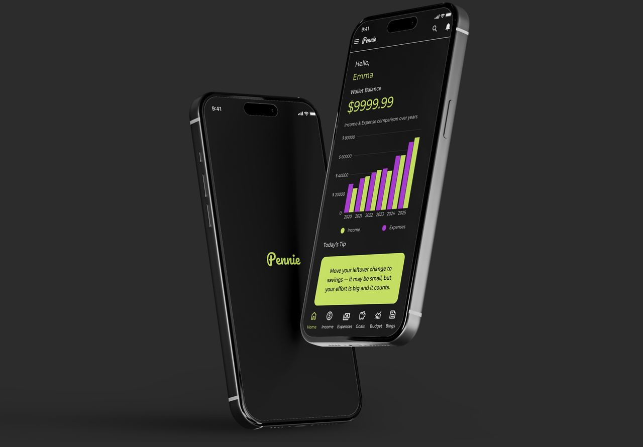
Pennie is a smart, user-friendly app designed to make budgeting, saving, and tracking expenses easier; especially for people juggling careers, family, and unpredictable incomes.
Problem
People with unpredictable incomes feel overwhelmed managing money. Balancing essentials, savings, and goals is challenging, and most budgeting apps are too complex or rigid. This leads to frustration, guilt, and inconsistent habits.
Solution
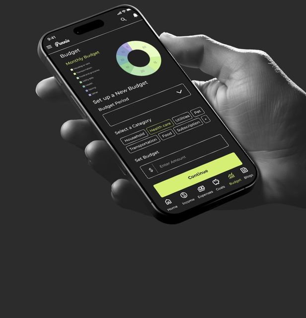
Pennie simplifies budgeting by helping users track income, log expenses, set goals, and review past spending. With flexible tools and motivational content, it makes money management clear, supportive, and easy to stick with.
Competitive Analysis
I conducted a competitive audit of four financial apps: Goodbudget, Empower, NerdWallet, and YNAB to understand their strengths, limitations, and user experience strategies. This helped identify opportunities for Pennie to stand out by offering a simpler, more motivating approach to budgeting and saving.
-

GoodBudget
Uses the envelope budgeting system and offers helpful guides, courses, and savings features. However, its interface can be overwhelming for new users, with a cluttered homepage and confusing navigation.
-

YNAB
Offers a standout experience with consistent visuals, user-friendly flows, and helpful guides, blogs, and workshops. Its layout is clean and highly accessible, though some sections feel slightly over-detailed.
-

Nerd Wallet
Focuses on financial literacy with a strong visual interface and a wide range of tools (credit cards, loans, investments). While engaging and well-organized, its dense information can be too complex for beginners.
User Flow
Logo
Color Palette
I chose a clean, modern palette to enhance clarity and user engagement. #2C2C2C ensures strong text contrast, #FFFFFF keeps the content readable, #D5EE74 highlights growth and savings, while #B94FE0 adds energy and motivates the user.
- #2C2C2C
- #FFFFFF
- #D5EE74
- #B94FE0
Typography
I chose Montserrat for its clean, modern style that improves readability and gives the app a simple, approachable feel—ideal for a stress-free budgeting experience.
Montserrat
Aa Bb Cc Dd Ee Ff Gg Hh Ii Jj Kk Ll Mm Nn Oo Pp Qq Rr Ss Tt Uu Vv Ww Xx Yy Zz
1234567890 .,;’!@#$%^&*
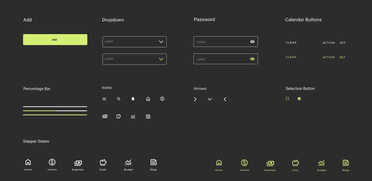
UI Kit
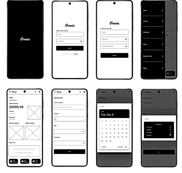
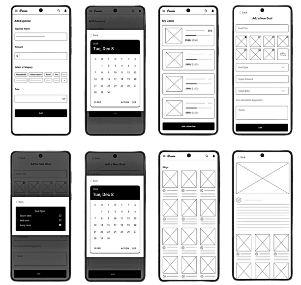
Low Fidelity Prototype
Usability Study
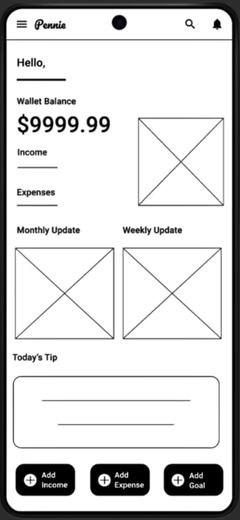
I tested the interactive low-fidelity prototype with 3 participants to evaluate ease of use and navigation.
Insights
- Users found it hard to move between pages since the only option was the top menu or the search option.
- Navigation felt slow and unintuitive.
Improvements
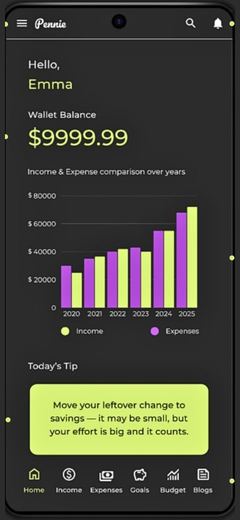
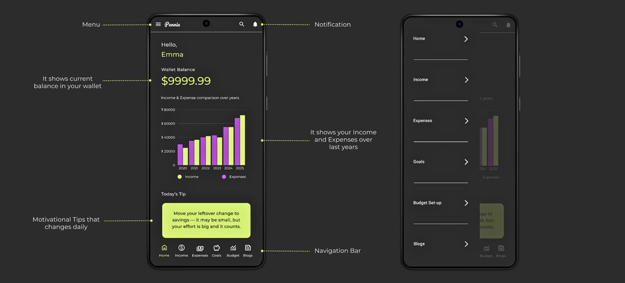
I added a bottom navigation bar with icons, making it easier to switch between pages quickly without relying on the menu.
High Fidelity Prototype
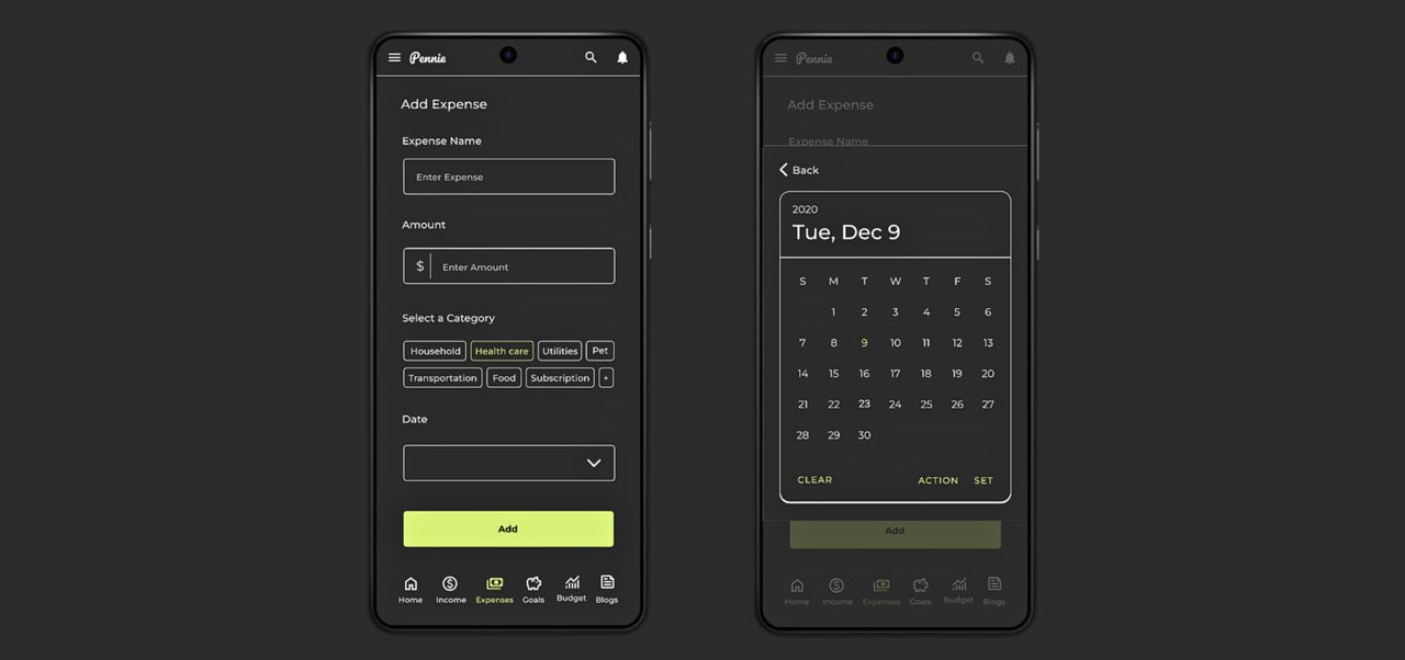
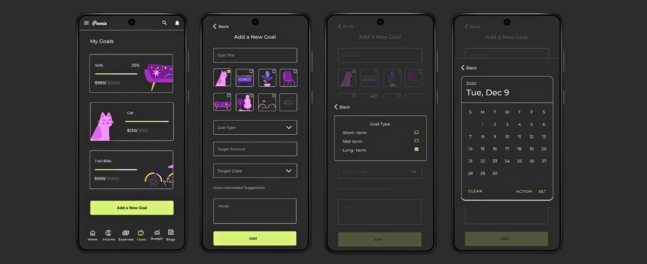
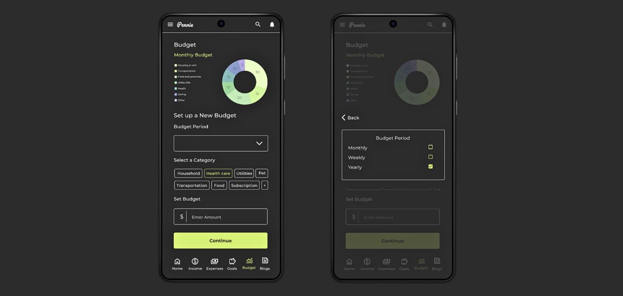
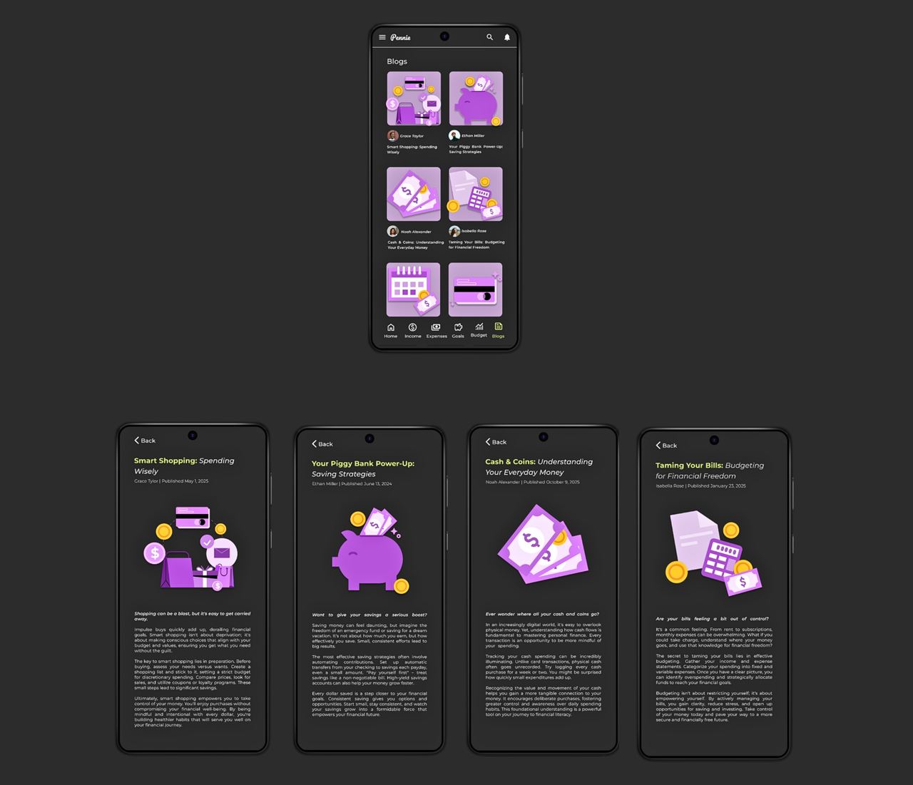
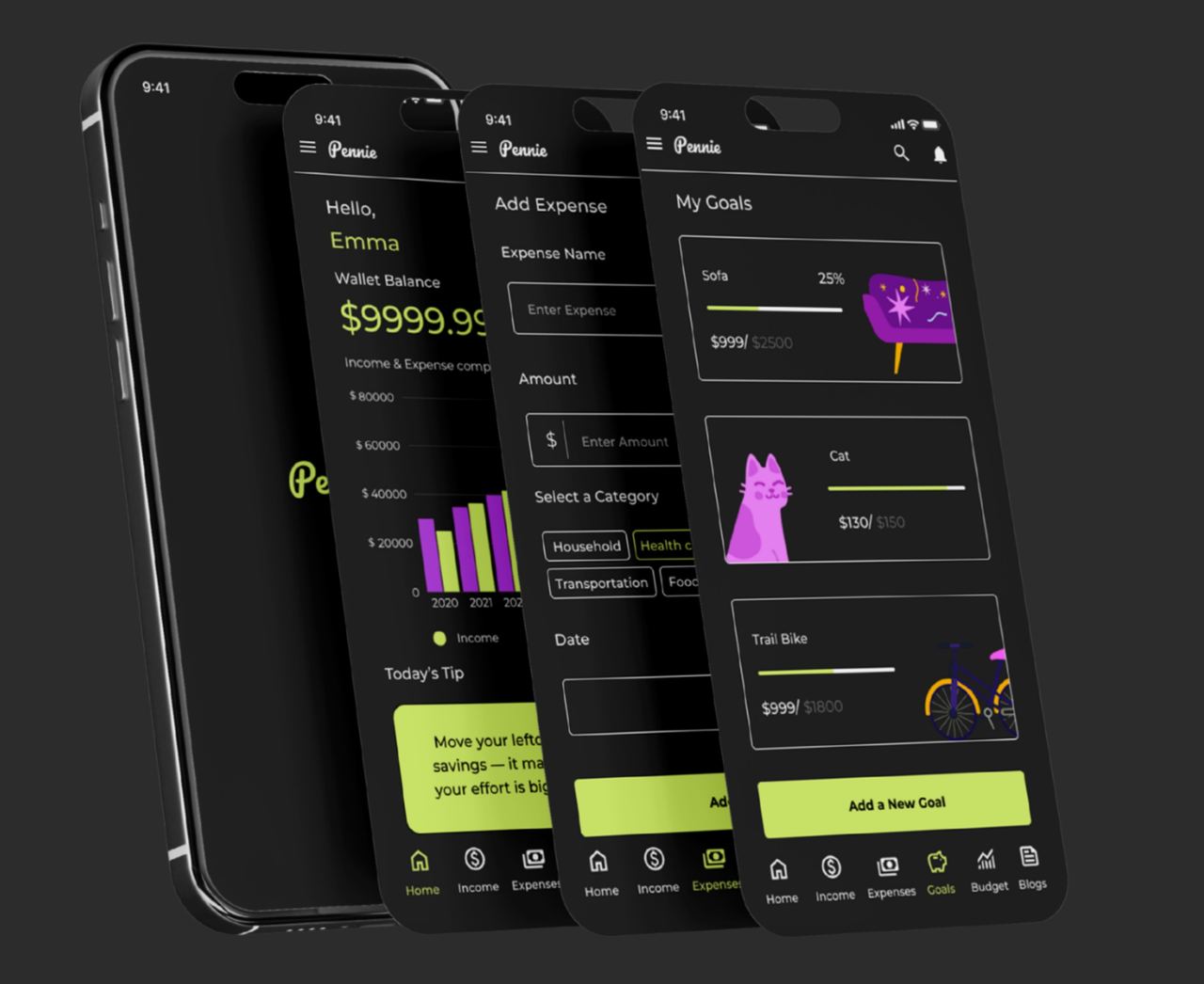
Usability Study
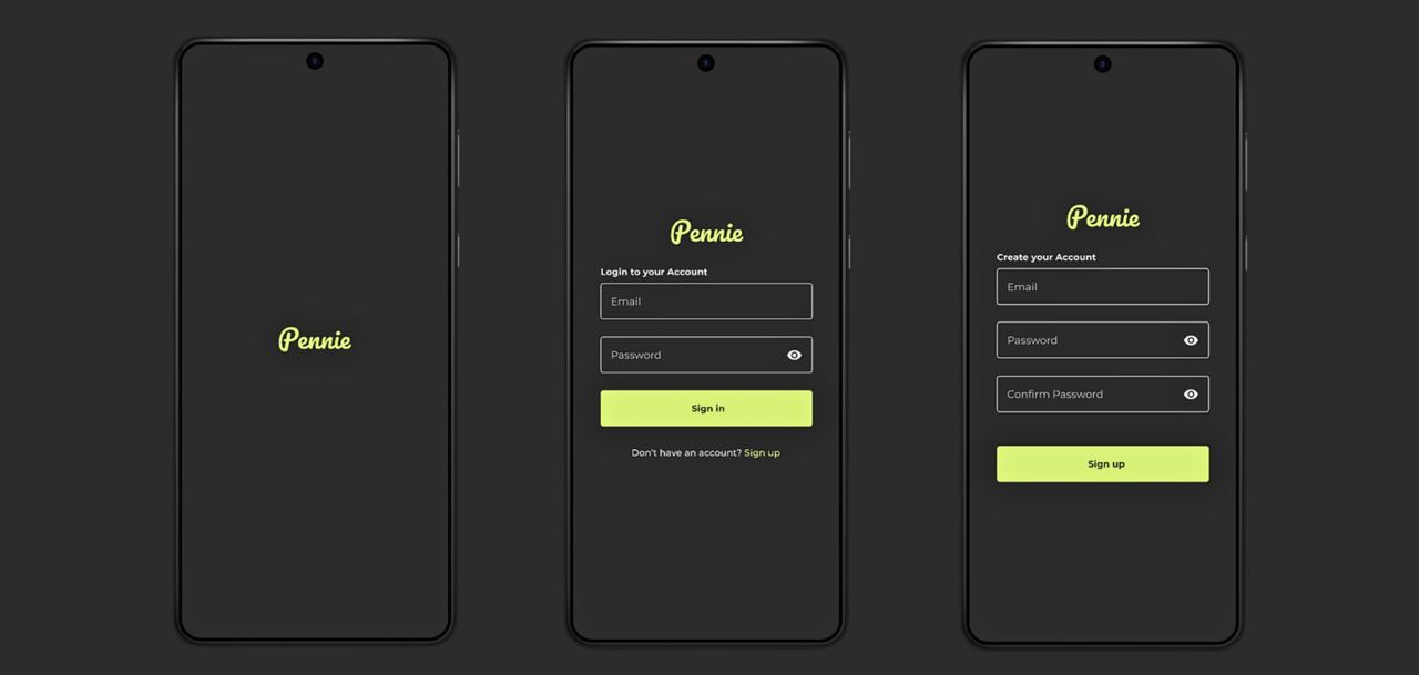
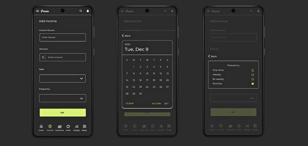
I tested my final prototype with participants to evaluate how user-friendly and accessible the app was for my target audience.
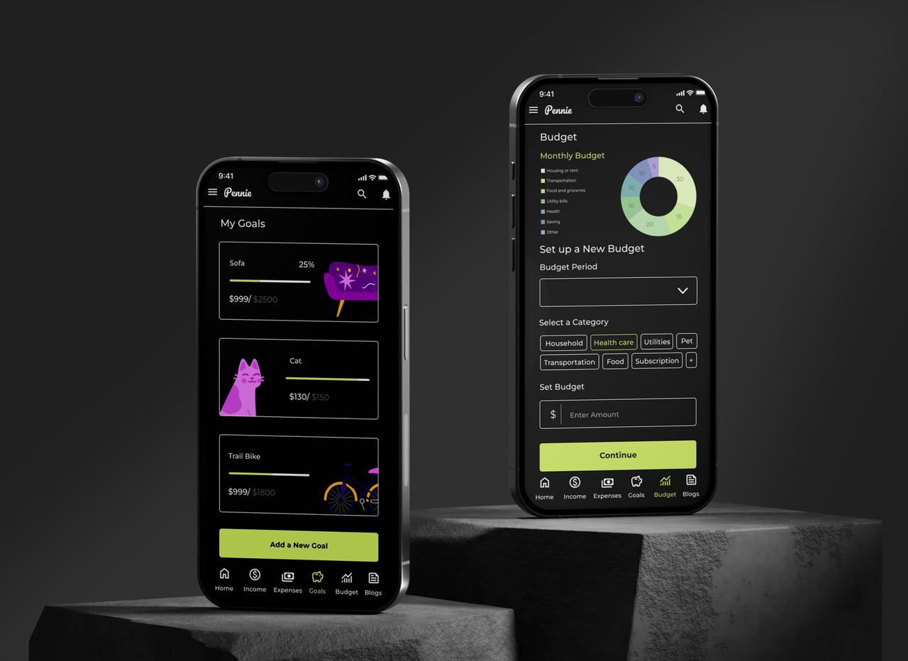
Insights
- Users found the interface clean and easy to understand.
- Most were able to complete tasks like adding expenses, setting budgets, and viewing progress without help.
- The new bottom navigation bar improved usability and made switching between pages effortless.
- Overall, participants felt the app was helpful and motivating for managing their finances.
Final Reflection
Designing Pennie was a fulfilling journey—from research to final design. I gained hands-on experience with new tools and learned the importance of creating solutions that are both practical and emotionally supportive.
Despite some challenges, staying focused helped me grow as a designer. This project reminded me that understanding real user needs is key to building meaningful, relatable experiences.