Problem
Students who travel around campus late at night often feel unsafe. Fewer buses, long SafeRide waits and dark walks make getting home stressful, and transportation information is scattered across different apps.
WorkUX Design
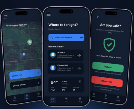
GoSafe is a nighttime safety and transportation app that helps Iowa State students plan their way home and feel confident on the journey, especially when they travel alone or don’t have a car.
Students who travel around campus late at night often feel unsafe. Fewer buses, long SafeRide waits and dark walks make getting home stressful, and transportation information is scattered across different apps.
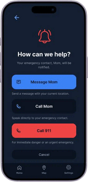
GoSafe brings every travel option into one place, plans the best route, and quietly checks in when something seems off. With one tap, students can tell their emergency contact they’re safe or ask for help.
I interviewed three Iowa State students about how they get around campus at night, when they choose buses, SafeRide, cars or friends, and what makes a trip feel safe or unsafe.
“I’m usually pretty scared to walk around campus at night.”
ISU STUDENT
Students would rather wait longer or change plans than walk alone.
They jump between MyState, Apple Maps and SafeRide to piece together a trip.
Waiting alone raises anxiety, especially when plans are uncertain.
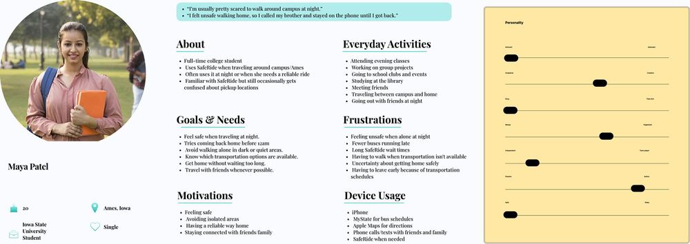
Maya is a 20-year-old full-time student with evening classes. She uses SafeRide and wants to get home before midnight, avoiding dark or quiet areas whenever she can.
Her story helped keep the design grounded in the real decisions students make when traveling at night.
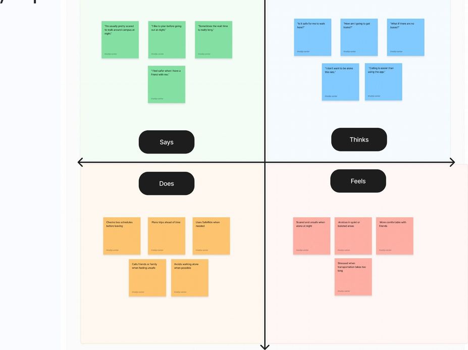
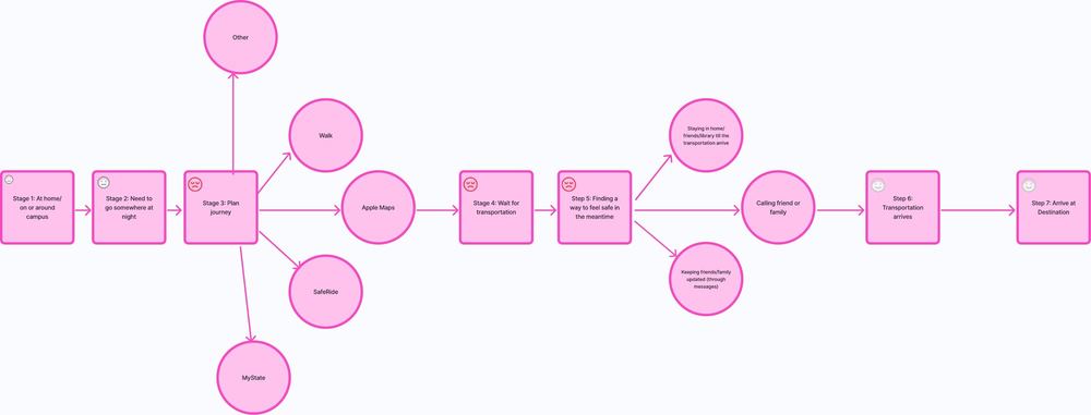
Students are willing to wait longer, change plans or call someone they trust just to avoid walking alone. Feeling safe matters more than getting there quickly.
How might we help ISU students plan nighttime transportation without the frustration, and feel less uncomfortable during the journey?
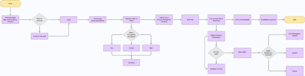
Behavior design helped turn the research into small, timely moments of support throughout a trip.
See every travel option in one place, with a recommended journey ready to go.
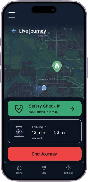
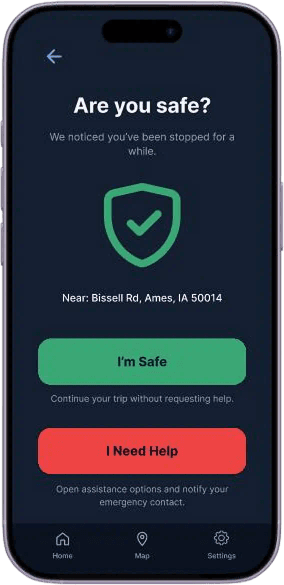
A gentle “Are you safe?” prompt appears when the app notices a long stop.
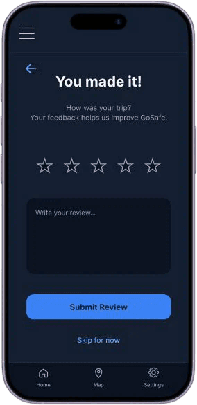
Rate and review each journey to help improve future recommendations.
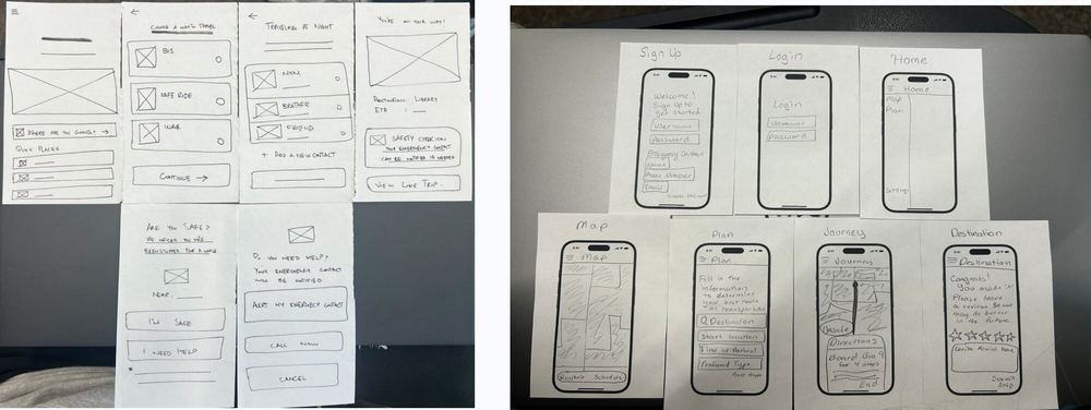
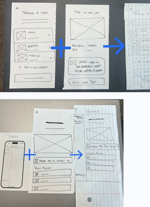
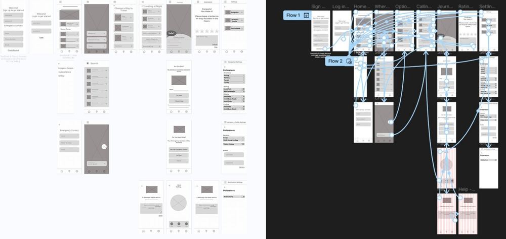
I started with paper sketches, tested the layouts, then combined the clearest ideas into a low-fidelity prototype. Testing showed that navigation, visible emergency contacts and working buttons mattered most.
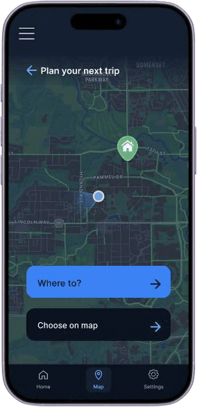
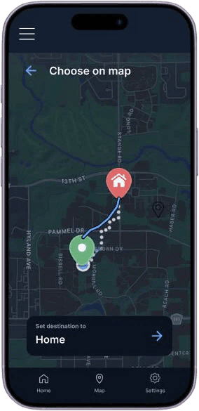
I chose a dark, calm palette that’s easy on the eyes at night. Deep navy sets a quiet base, blue guides each action, green confirms safety, and red is saved for moments that need help.

Travel options appear as simple cards, making it easier to compare and decide.
Large, clear “I’m Safe” and “I Need Help” actions are easy to reach.
Students can choose a saved emergency contact during setup.
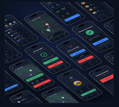
From choosing a route to letting someone know you made it, each screen keeps the next step clear.
The best solution isn’t always the fastest one.
Students cared more about feeling safe than getting home quickly, so I designed for that feeling first. Testing at every stage, from paper to high fidelity, showed me how small changes like bigger buttons, clearer navigation and fewer choices matter most in stressful moments.